

Google’s new Resizer tool for a better responsive web
Random Article
Google’s new Resizer tool for a better responsive web
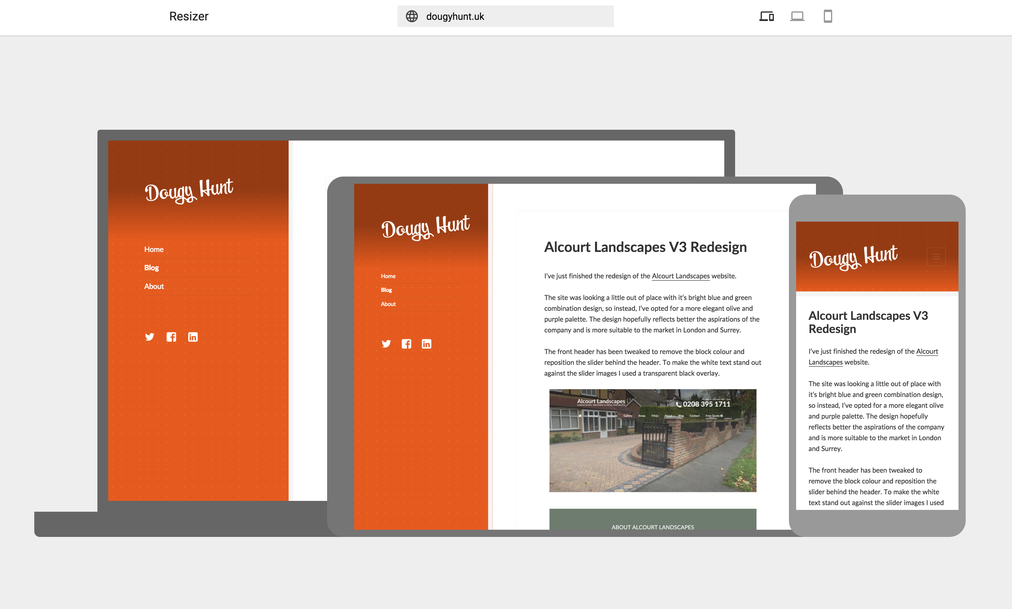
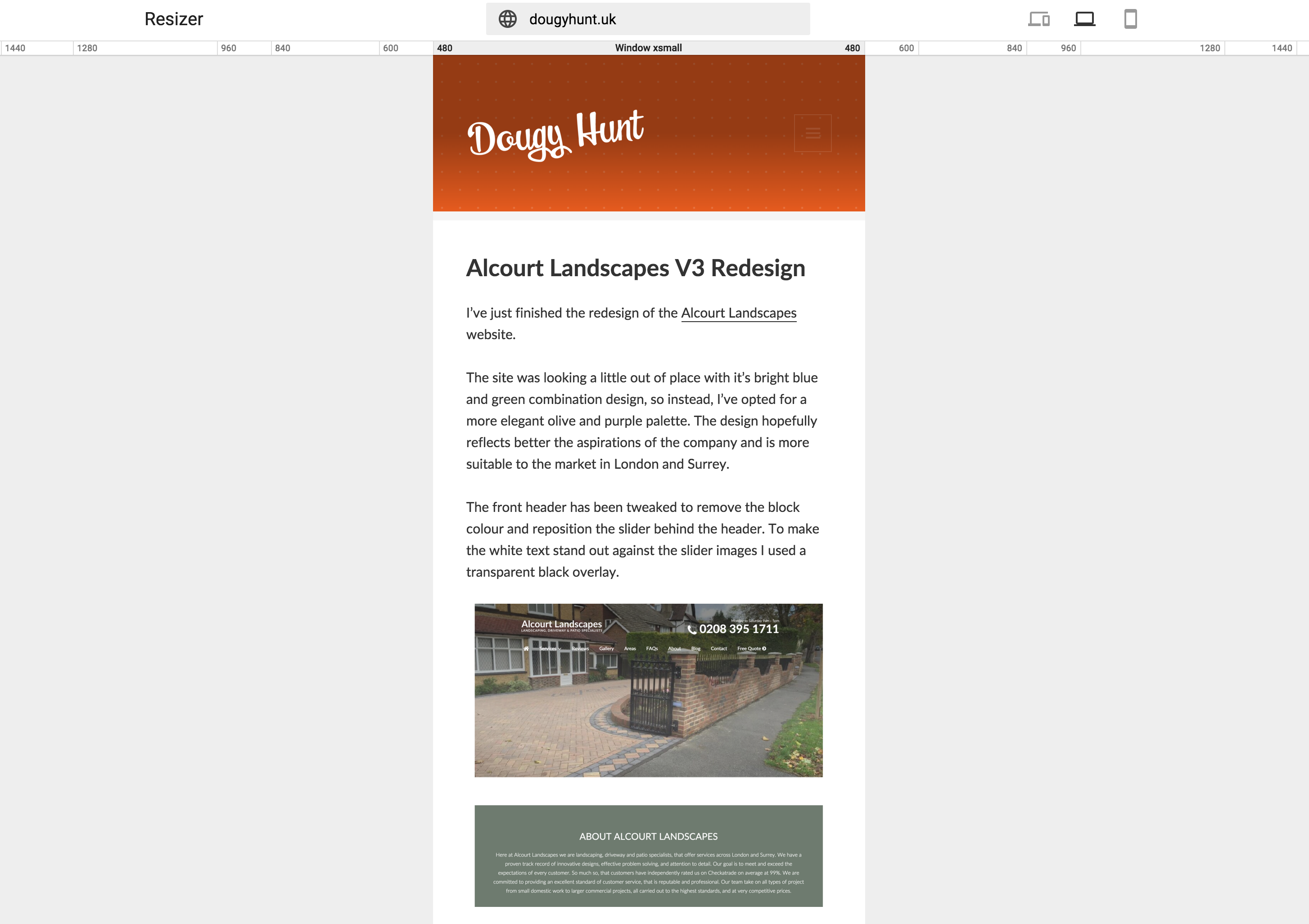
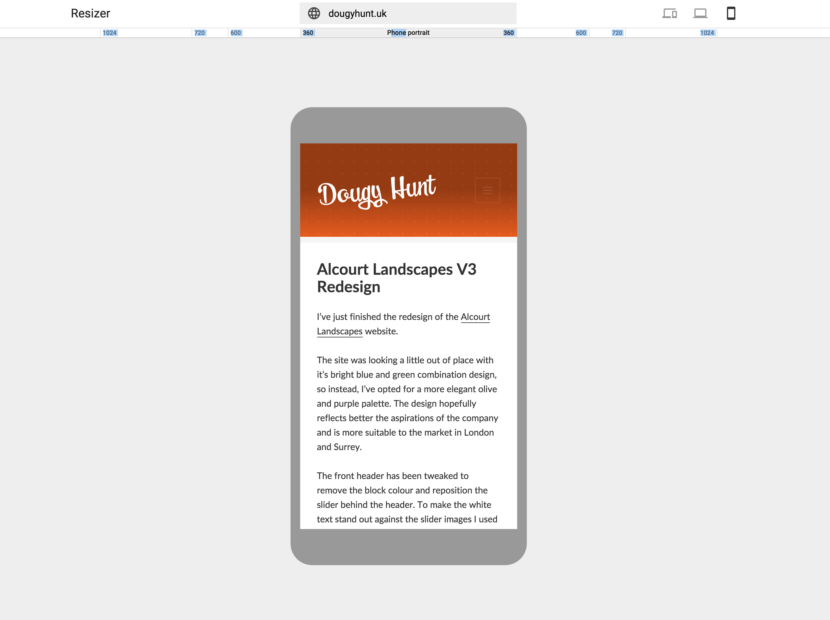
Google have just released a free tool that allows you to check how your website looks on a range of different screen sizes.
The Resizer tool is completely free and lives at design.google.com/resizer.
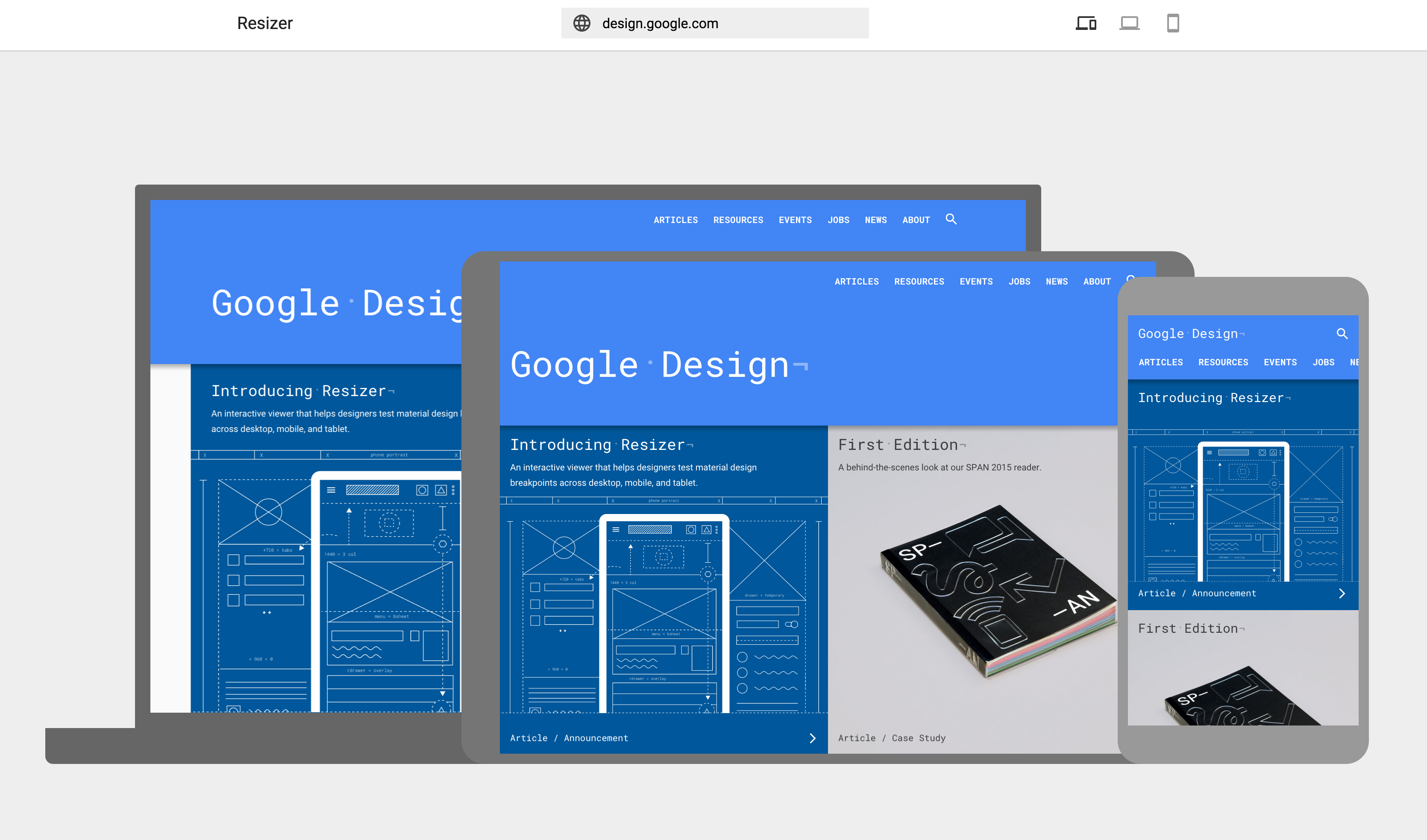
This tool is pretty sweet as it lets you see a live version of the site. Not just that but it’s also a great free way to grab screenshots of sites on different devices to send to a client.
The tool comes with three different options. The first is the three device version with a laptop behind a tablet and a smartphone at the forefront.
The second viewable option is a simple resizer with a changeable ruler at the top of the screen. Clicking the different widths on the ruler changes the screen dimensions.
The final option is similar to the option above but instead of just the viewable screen area, it shows the screen enclosed within various device sizes.


Comments
Take part in the discussion
Discussion about Google’s new Resizer tool for a better responsive web article, if you have any questions, comments or thoughts then get leave a reply.